Health Informatics | Data | Dashboards | Healthcare
Fixing fragmented data in healthcare: How dashboards, reporting and health informatics work together
TL;DR: If you work with data or IT in a hospital, PHN or healthcare service and you’re struggling with fragmented systems, reporting delays, or data no one trusts, this article is for you. We break down how real-time dashboards, structured reporting, and good health informatics can help you simplify processes, meet compliance, and support better care decisions.
Why many healthcare teams struggle with data
You’re probably not short on data. But you might be short on clarity, time, or trust in the tools you’re using. Sound familiar?
- Your clinical dashboard shows one number, but your finance report shows another
- Reporting to funders takes weeks, pulling data manually from multiple systems
- Teams rely on workarounds—Excel exports, screenshots, or re-keying info
- You’re making critical decisions, but the source of truth keeps shifting
Whether you're in a public hospital, PHN, Aboriginal health service or state-funded program, these problems all stem from the same root issue: disconnected data.
That’s where better dashboards, reporting, and health informatics come in.
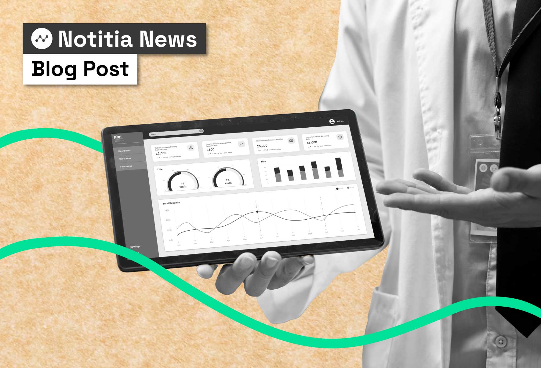
What healthcare dashboards are actually meant to do
At a basic level, a healthcare dashboard is a tool that pulls your most important data into one place. But good dashboards go further:
- They answer the questions your team needs daily — like “how many clients were seen by our mental health teams this week?” or “what are our top 3 referral sources?”
- They update automatically — no more chasing spreadsheets
- They’re role-based — giving the right view to clinicians, program leads, or CEOs
- They connect upstream and downstream — supporting both operations and reporting
If your dashboards aren’t doing that, they’re just pictures.
But, dashboards alone aren’t enough
Dashboards are great for monitoring live data. But they fall short when:
- You need to compare over time (e.g. quarter-on-quarter, or year-to-date vs funding targets)
- You need narrative reporting for funders or board packs
- You want to track service impact across patient cohorts or LGAs
That’s where structured healthcare reporting comes in.
Reporting helps with:
- Regular updates for funders, commissioning agencies or government
- Compliance audits (e.g. NWAU, PMHC-MDS, AOD-MDS)
- Performance tracking across regions, services or timeframes
- Building evidence for funding, investment or strategy
You don’t need two tools. You need one ecosystem that does both.
The real reason most dashboards don’t work: Weak informatics
We’ve seen it time and again. Dashboards are built before the underlying informatics architecture is sorted. The result?
- Mismatched numbers
- Duplicate metrics with unclear definitions
- Low trust from users
- A dashboard that’s pretty, but ignored
Health informatics fixes that.
It’s the discipline that connects and standardises your systems—EHRs, CRMs, finance, rostering, clinical notes—so you have:
- Clear definitions
- One source of truth
- Secure access
- Governance, auditability, and traceability baked in
It’s not a “nice to have”. It’s the foundation of dashboards and reporting that actually work.
What is health informatics?
Health informatics is the practice of connecting, standardising, and managing health data from multiple systems — such as electronic health records, clinical notes, CRMs, and population health datasets — to create a single, reliable source of truth. It combines healthcare expertise, data management, and technology to improve decision-making, ensure compliance, and support better patient outcomes.?
In practice, health informatics involves:
- Data integration: Connecting and mapping data from multiple sources.
- Standardisation: Creating consistent definitions for key metrics so there’s a single “source of truth.”
- Data governance: Ensuring data is secure, accurate, and used in line with privacy laws and compliance requirements.
- Accessibility: Making the right data available to the right people at the right time — from clinicians to executives.
Health informatics is the foundation that allows dashboards and reporting tools to work properly. Without strong informatics, teams end up with mismatched numbers, low trust, and manual workarounds.
A practical framework: how health informatics dashboards and reporting work together
Let’s say you’re in a PHN or local health network. You need:
- Daily visibility over service delivery
- Reliable reporting to the Department of Health
- Evidence for outcomes and strategic planning
Here’s how it fits together:
Health informatics
Connects, maps, and cleans data from multiple sources. For example, it can integrate PMHC-MDS, CRM, and population health datasets to create a single, reliable view.
Dashboards
Displays live, actionable data so decision-makers can act quickly. For instance, you might track referrals, waitlists, and discharges in real time.
Reporting
Generates structured summaries that can be shared with others. This could include quarterly snapshots or funding reports tailored to specific stakeholders.
If you’re missing one of these pillars, you’ll always struggle to deliver insights that are trusted, timely, and complete.
A real-world health informatics example: West Gippsland Healthcare Group (WGHG)
West Gippsland Healthcare Group is a regional hospital that needed a faster, more reliable way to support executive and departmental decision-making. They had a data and digital transformation plan but lacked the internal resources to deliver it.
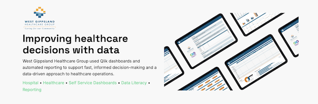
Partnering with Notitia, WGHG implemented:
- Custom Qlik dashboards built for both high-level executives and department leads
- Automated reporting to reduce manual effort and delays
- A single, centralised data table to ensure consistency across reports
- Dashboards for National Weighted Activity Unit (NWAU) tracking, supporting compliance and planning
- UX/UI wireframes to improve usability and user engagement
- Data literacy training to build internal capability and confidence
In just six weeks, they:
- Enabled faster, data-driven decisions across teams
- Improved responsiveness to fluctuations in patient demand and resourcing
- Built a reporting foundation that supports both internal goals and Department of Health auditing
It’s a clear example of how dashboards, reporting and informatics come together to create system-wide impact — without needing a large internal data team.
How to get started in your health service
Whether you’re a data analyst, digital lead, CIO, or program manager, here’s how to get traction:
- Map user needs. What are people asking for each day?
- Audit your systems. What data do you already collect, and where does it live?
- Document your data. Define key metrics and map how they’re calculated
- Build one data layer. Use tools that connect sources and transform data once
- Design for your audience. Dashboards for daily use, reports for funders
- Invest in governance. Decide who owns what, and review it regularly
You don’t need to start from scratch. But you do need to stop working in silos.
If you’ve ever spent a week chasing data for a report—or wasted a meeting explaining a dashboard number—there’s a better way.
Dashboards + reporting + health informatics = clarity, compliance and confidence.
It’s not about choosing the “right tool”. It’s about designing a data environment that works for your people, your processes, and your goals. Contact us to chat through how we can help with your next project.


