What is User Interface (UI)? | UI vs UX – Key Differences | Why UX Design Matters with UI | The Role of UI in Business and Data Analytics | Human-Led Design in Digital Projects
TL;DR What is User Interface (UI)?
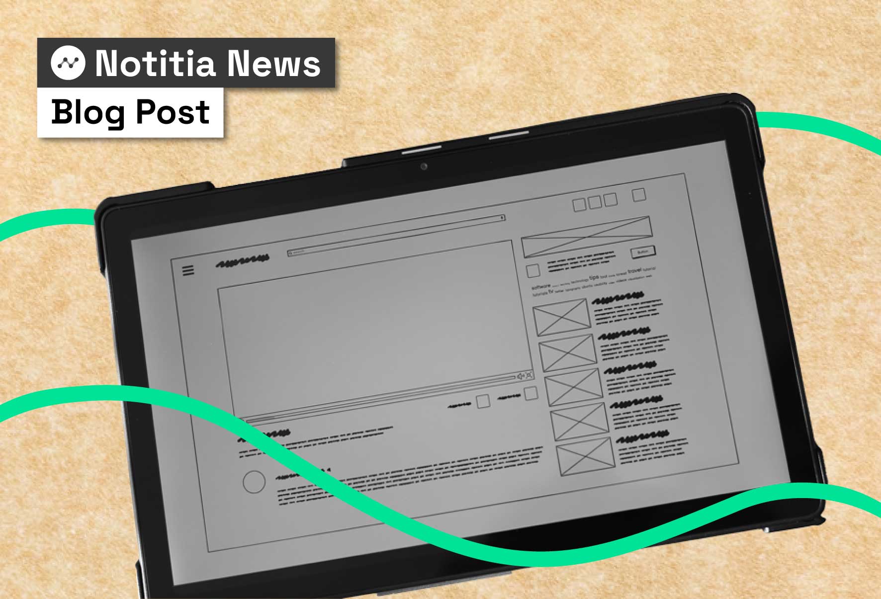
A User Interface (UI) is the layer where people interact with technology — the buttons, menus, text, and visual cues that translate human intention into digital action. Effective UI design makes interactions clear, efficient, accessible, and predictable. In practice, that means following recognised interaction principles such as ISO 9241-110 and accessibility standards like WCAG 2.2.
What does UI mean?
A user interface is the point of human-computer interaction — any modality (visual, touch, voice, etc.) through which data flows between a person and a system.
Without a UI, even the smartest system would be inaccessible. Think of an app with no buttons or a dashboard with no navigation. UI is the bridge between human intention and digital response.
Good UI design applies well-established principles: suitability for the task, self-descriptiveness, conformity with expectations, error tolerance, and learnability (ISO 9241-110). These make interfaces predictable and easier to use.
For organisations engaging a data consultant or analytics consultant, this means the interface isn’t just the “front-end”—it’s where consulting data analytics projects succeed or fail. A confusing UI can make even the most powerful data-driven platform unusable, while a clear one builds confidence and drives adoption across teams.
UI vs UX – What’s the difference?
Although closely related, UI and UX serve different purposes:
- UI (User Interface) — the visual and interactive layer: layout, controls, typography, colour, and states.
- UX (User Experience) — the overall journey and satisfaction: how easy and meaningful it is to complete goals.
In short: UI is what people see. UX is how it works. Both must align to create digital products that people actually use.
That distinction matters for every data science consultancy or analytics and consulting partner. A sleek dashboard with poorly thought-out workflows is frustrating, just as a well-planned workflow with an ugly, cluttered interface will discourage adoption. Great digital solutions require the marriage of both — beautiful, intuitive UIs and seamless, data-driven UX.
Why UX design matters alongside UI
While UI is the visual layer, UX determines whether users can achieve their goals easily and enjoyably. A clean dashboard is meaningless if workflows are clunky, or if navigation forces people into endless clicks.
UX is about mapping the journey, reducing friction, and ensuring technology supports the way people already work. This is why great products don’t just look good — they feel intuitive. For example, in a business intelligence consultation, UX ensures that KPIs surface in one click instead of ten, saving hours across an organisation.
At Notitia, our UX design and digital design services are grounded in evidence. We use research, prototyping, and co-design to ensure dashboards and applications meet user needs from day one. For a deeper dive into this, see our blog: What is UX Design and Why It Matters.
Why UI matters for businesses in Australia
In healthcare, government, FMCG, and infrastructure, UI design is not cosmetic — it’s strategic:
- Healthcare: Confusing dashboards delay care. Clear UIs improve decision-making and trust.
- Government: Citizens expect intuitive self-service portals. Usable design reduces errors and boosts adoption.
- FMCG & Supply Chain: Poorly designed UIs slow reporting. Simple layouts reduce training costs and increase efficiency.
- Not-for-Profit: Visual clarity enables faster, more accurate action where community impact is at stake.
Research also shows first impressions of a UI are formed within 50 milliseconds, underscoring the importance of clarity and visual hierarchy.
From the perspective of a data analytics consultancy, UI matters because it directly impacts ROI on digital projects. Well-designed dashboards increase trust in analytics, shorten the training cycle, and reduce dependency on support teams.
For a manufacturing consultation, that means production managers can spot issues faster. For government projects, intuitive UIs reduce drop-offs on public portals. And for a not-for-profit, clarity in dashboards means life-changing decisions can be made with confidence and speed.
Human-centre design in data projects
Human-centre design means placing the end-user at the centre of every project. Rather than starting with technology, we begin with people: their workflows, challenges, and goals. This approach ensures that digital tools don’t become “shelfware” but are actively used and trusted.

In our consulting, this takes the form of persona mapping, stakeholder interviews, and co-creation workshops. By listening first, we avoid building features no one needs and instead design solutions that are both culturally aligned and technically sound.
For example, our work with Aboriginal organisations like Bubup Wilam and SNAICC shows how human-centred design principles can empower communities by making data more accessible, respectful, and actionable.
Human-Centred Design (HCD) ensures digital tools like dashboards and software actually work for the people using them. Notitia applies HCD across every stage of data and digital projects — from stakeholder interviews to co-designed prototypes and tailored training. Read more about our approach in our blog.
This philosophy underpins our Design & Development Services, ensuring that every dashboard, portal, or platform is designed with users, not just for them.
Principles of effective UI design
- Consistency & Standards — follow platform conventions and keep internal patterns uniform
- Simplicity & Clarity — minimise cognitive load and focus on essentials
- Accessibility — comply with WCAG 2.2 AA (e.g., 4.5:1 colour contrast, keyboard navigation, screen reader support)
- Feedback & Visibility — show system status (loading, error, success states)
- User Control & Flexibility — provide undo, back options, and shortcuts for advanced users
These aren’t just design ideals — they are practical, measurable rules that affect usability. Consistency cuts down retraining time. Simplicity prevents abandonment. Accessibility widens usage across diverse users. Feedback builds trust, while flexibility ensures advanced users stay productive.
As data consultants in Australia, we embed these principles in every dashboard and reporting tool. In consulting data analytics projects, we’ve seen how small changes — such as adding visible error states or colour-coded progress bars — can dramatically improve adoption. This is why businesses engaging a data science consultancy or analytics consultant should always ask how UI principles are applied in practice.
Real UI design examples from Notitia projects
Bubup Wilam – Customised Web Application for Indigenous Data Sovereignty
Bubup Wilam, an Aboriginal Child and Family Centre, needed a “virtual doorway” that centralised records and respected Indigenous data sovereignty.
The custom-built UI allowed educators, families, and practitioners to access a holistic “child view”, while maintaining strict access rules and compliance with Australian data sovereignty laws.
- UI highlights: Role-based portal, secure logins, accessible dashboards, hosted in Australia.
- Outcomes: Reduced admin, faster communication, long-term compliance.
This project demonstrates how analytics and consulting approaches must go hand-in-hand. By combining UI design with data governance and sovereignty requirements, the solution balanced technical needs with cultural respect.
SNAICC – Cloud-Powered Advocacy Platform
SNAICC, the peak body for Aboriginal and Torres Strait Islander children, partnered with Notitia to build a platform that supports advocacy, storytelling, and policy impact.
Through a co-design process, Notitia developed persona-based dashboards aligned with SNAICC’s editorial style and governance needs.
- UI highlights: Persona-based dashboards, plain-language reporting, government-aligned mapping, governance features.
- Outcomes: Evidence-backed advocacy, adoption across literacy levels, sustainable governance.
This case study highlights how business intelligence consultation and UI design intersect. By focusing on personas, language accessibility, and advocacy impact, the solution became more than a tool — it became a strategic lever for reform.
Future of UI in AI and data-driven products
UI design is rapidly evolving:
- Natural-language interfaces: Qlik and Astrato support plain-English queries.
- Adaptive UIs: AI tailoring interfaces to roles and behaviours.
- Ambient UIs: Interfaces blending into environments (e.g., hospital capacity screens).
- Notitia’s PlotBeam: Demonstrates responsive UIs updating in real time as data changes.
These innovations matter for every analytics consultant and automation consultant. Natural language queries reduce the barrier to data adoption. Adaptive and ambient interfaces make analytics part of the flow of work. And dynamic visualisation platforms like PlotBeam show how data-driven design can make reporting proactive instead of reactive.
Human psychology & perceived usability
The aesthetic–usability effect shows attractive designs are often perceived as more usable.
Coupled with research showing users form impressions in milliseconds, good visual design supports usability and trust.
This is why in consulting data analytics projects, we balance form and function. As an analytics consultant, the goal isn’t just to deliver reports but to ensure the interface makes people want to use the product. Trust in design leads to trust in the data — which is the foundation of any data consulting Australia project.
UI takeaway
A strong UI is more than aesthetics — it’s a business enabler. It bridges human intention and digital execution, fosters trust, and makes data usable.
At Notitia, we combine user research, inclusive design, and cultural alignment to deliver interfaces people actually use. Projects like Bubup Wilam and SNAICC show that when UI is designed with sovereignty, accessibility, and advocacy in mind, technology becomes a tool for empowerment and impact.
That’s the advantage of working with a data science consultancy that also operates as an analytics and consulting partner. Our role is not just as data consultants in Australia but as guides who blend design, technology, and strategy — helping clients build the kind of data-driven interfaces that drive adoption, improve processes, and create lasting business impact. Want to know more? Book in a chat with our team here.


