Website redesign | Digital Designer | User Persona Mapping | Meet Notitia's Digital Designers
TL;DR Inside Notitia’s full website redesign
How our digital designers used UX, UI and digital design strategy to improve user experience and performance.
Not every website needs a full overhaul. Sometimes, all it takes is a few thoughtful tweaks to elevate the experience and support your goals. But first, it’s critical to understand how your website is performing—and more importantly, how your users are experiencing it.
For Notitia, that meant looking closely at how our website aligned with our identity today. The short answer: it didn’t.
While our old site was technically functional, it had become out of sync with how we’d grown—both in size and capability. And as digital designers who regularly guide others through transformation projects, we knew it was time to practise what we preach.
This wasn’t just a visual update or a branding refresh. It was a full re-evaluation of how we present our work, how we guide users through our services, and how we reflect the depth of our digital design, development, and data consulting capability.
Read on to find out how Notitia's Digital Designers Carolina and Yuri, approached the process—step by step.
>Read the full case study here<
Why we updated our website: Word from our Digital Designer
According to Notitia Digital Designer, Carolina Perez Dilsizian, our business had changed.
"The way we work had evolved. Our clients were asking different questions, and our services had matured in response. But our website hadn’t kept pace," Carolina said.
"It’s a common problem—particularly for consultancies and service-led businesses.
"Over time, your positioning sharpens, your work deepens, and your value becomes clearer. But your website continues to serve yesterday’s version of your business."
So, we decided to treat ourselves like a client, Carolina said.
"We started with research, led by our UX team," she said.
"We looked at what was working, what wasn’t, and what needed to shift. The goal wasn’t to build something flashy—it was to build something clear, helpful, and genuinely representative of who we are.
"What we discovered wasn’t surprising—but it was useful."
What the research revealed
We used a combination of user surveys, behaviour tracking, and internal workshops to pinpoint the specific challenges users faced when navigating our site. These insights helped us identify the following key issues:
- Lack of clarity for new users
Visitors unfamiliar with digital consulting or analytics services often struggled to understand what we actually did and how we could help them. - An ineffective homepage
Our homepage didn’t function as a strong navigation hub. Users often stopped there, rather than exploring the rest of the site. - Confusing information architecture
There were too many dead ends, loop-arounds, and unclear menus—making it difficult for users to follow a clear journey. - Content visibility problems
Valuable content (case studies, service pages, blog posts) wasn’t always easy to find or digest, due to layout and design decisions.
Armed with this evidence, we were ready to move from analysis into action.
If you're wondering what digital designers actually do behind the scenes of a website redesign, we've written more about it in this post. It unpacks the role of a UI/UX designer—what the job really involves, how strategy shapes outcomes, and why good design is about more than just visuals.
Our process: Design thinking from the inside out
As with all of our client projects, we followed a structured, design thinking process—one built around empathy, experimentation, and iteration. Here’s how that looked in practice.
Step one: Empathise & define
Understanding our users was the first step. We used Typeform surveys to gather honest feedback on how people used our site—and how it made them feel. These insights revealed what our users were confused about, where they were dropping off, and which content they found valuable.
We also installed Hotjar to observe user behaviour in real-time. Heatmaps and session recordings showed us how users navigated the site, where they got stuck, and which areas attracted the most attention.
From this, we developed a list of user needs and frustrations, which we then distilled into a problem statement to guide our next phase. We didn’t just want a better-looking website—we wanted one that clearly solved the problems our users were facing.
This approach reflects the design mindset of Notitia’s own team. Yuri Chae, one of our digital designers, has spoken about the importance of listening and observing as a foundation for strategic, user-centred design. Her journey—from visual design to UX strategy—helped shape this phase of the project.
Step two: Ideation
With a clear understanding of the problems, we began generating ideas. We ran a series of collaborative sessions to reimagine the site structure, rewrite key messaging, and improve the navigation system.
Our main focus areas:
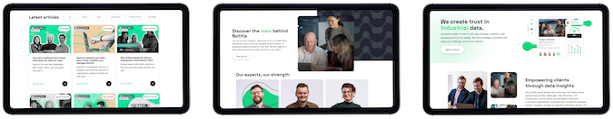
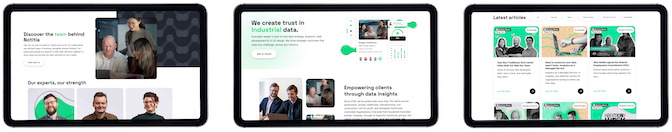
- Designing a new homepage that functioned as a true launchpad for users.
- Simplifying the sitemap to reduce complexity and dead ends.
- Improving internal linking so users could explore topics without friction.
- Making our services easier to find, understand, and compare.
We mapped out a new user journey that would reduce bounce rates, increase time on site, and make it easy for people to get in touch, browse our work, or explore our capabilities—regardless of where they landed.
Redesigning a website isn’t just about design aesthetics—it’s about connecting design with data to create real, measurable outcomes. We explore this further in Design meets data, a blog post that explains how human-centred UX and data insights work together to deliver meaningful results.
Step three: Prototyping
Once we had alignment on the direction, we built a prototype of the new site in Figma. At the same time, we began working on a refreshed brand identity—still recognisably Notitia, but with a cleaner, more cohesive visual system.
Key design decisions included:
- Simplifying the design
We removed animations that existed purely for aesthetics and kept those that added value or improved usability. - Replacing abstract visuals
While abstract and 3D icons looked nice, they hurt performance and didn’t reinforce our messaging. We shifted to literal, concept-relevant visuals that better supported the content. - Building a clear design system
We created consistent spacing, typography, and component rules to ensure each page felt part of a unified system—one that was easy to use, maintain, and expand in future. - Refining the colour palette
We reduced our palette for clarity and professionalism, while still keeping visual interest and contrast across different sections.
This design system was shaped by the thinking of Carolina Perez-Dilsizian, whose focus on clarity, inclusivity, and design equity continues to influence how we build products. Her emphasis on accessibility and meaningful user experiences helped guide decisions throughout this phase.
What we’ve built—and what’s next
The result is a site that feels more like us. It’s faster, clearer, and better aligned with what we do and how we work. More importantly, it works better for the people who use it.
Some of the most meaningful improvements include:
- A better homepage experience that sets the tone and encourages exploration.
- Easier access to key services, industries, and case studies.
- A scalable design system that supports future content, tools, and platform updates.
- A faster, more accessible experience across devices and screen sizes.
And like any strong digital design solution, it’s built to evolve.
Our team continues to track performance, test ideas, and tweak layouts—just like we do for our clients. Because a great website redesign isn’t a one-off project. It’s a living thing.
Thinking about a website redesign?
Whether your website needs a small restructure or a full rebuild, we can help you figure out the next step.
Our digital designers specialise in creating websites that reflect your identity, communicate your value, and support user needs—from the first interaction to conversion and beyond.
If you're considering a website redesign, let’s chat. Get in touch with the team at Notitia