Business intelligence dashboard | Human led design | Design led approach to dashboard creation
TL;DR
If your dashboards, apps, or reporting tools aren’t designed with end users in mind, they won’t deliver results. A design-led, human-centred approach ensures your digital solutions are intuitive, inclusive, and effective. At Notitia, our digital designers work shoulder-to-shoulder with analysts and developers to deliver tools people actually use, from healthcare dashboards to public-sector web platforms.
Why design-led matters more than ever
It’s easy to get caught up in platforms and code. None of that matters if the people you’re designing for won’t use it — or can’t use it.
“Technology should serve people, not the other way around… It’s critical to balance what the end product does on paper against how it will actually be used, and who will use it.” — Alex Avery, Managing Director, Notitia
Our approach flips the traditional process:
- Start with conversations, not code. We sit with stakeholders to understand their world.
- Map goals into something visible. No mystery, no jargon.
- Design around real users and roles. Not generic personas.
- Test and train in context. Teams walk away confident.
The payoff? Faster adoption, clearer decisions, and solutions that scale without rework.
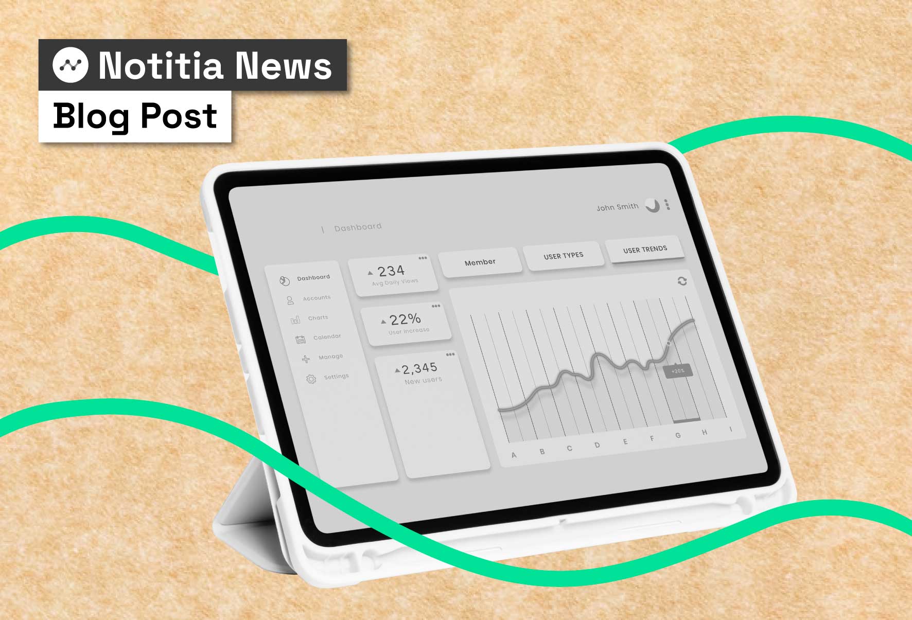
Dashboard design best practices (through a human lens)
Primary keyword coverage: dashboard design best practices
- Begin with purpose. What decision should this dashboard enable?
- Choose meaningful KPIs. Cut vanity metrics; align to outcomes.
- Reduce cognitive load. Clean layouts, scannable hierarchy, consistent patterns.
- Design for accessibility. Contrast, typography, colour use, keyboard navigation, responsive layouts.
- Guide the next action. Make it obvious what to click, filter, or drill into.
- Co-design with users. Workshops > assumptions. Validate early.
- Maintain like a product. Review monthly/quarterly; retire what’s not used.
“Without end-user input, assumptions drive development. When we prioritise behaviour, needs and workflows, we create solutions people actually want to use.” — Carolina Pérez-Dilsizian, Senior Designer, Notitia
How to build a dashboard (the design-led way)
Secondary keyword coverage: how to build a dashboard
- Empathise. Interviews and contextual enquiry.
- Define. Map decisions → metrics → data sources.
- Ideate. Sketch flows and states; compare alternatives.
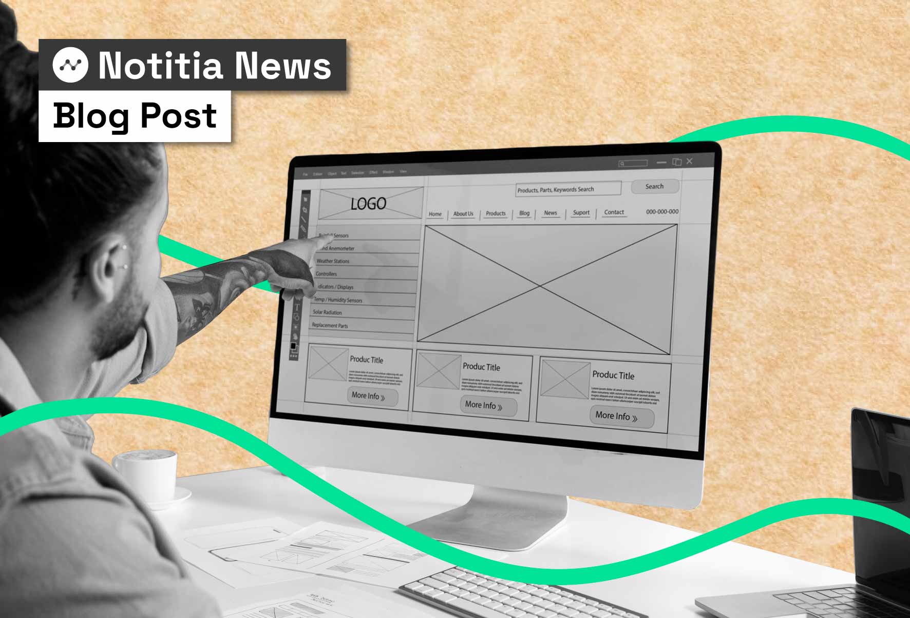
- Prototype. Low-fi wireframes to high-fi mock-ups before any heavy build.
- Test. Validate with real users; measure comprehension and time-to-insight.
- Implement. Connect trusted data in Qlik Cloud Analytics (or the chosen platform).
- Refine. Ship, observe, iterate. Bake in a feedback loop and training.
This approach shortens delivery time because you’re solving the right problem the first time — not retrofitting design afterwards.
Business intelligence dashboard examples (from real projects)
West Gippsland Healthcare Group (WGHG) — Theatre performance
- Goal: Simplify cost and performance tracking for theatre operations.
- Design focus: Clear visual hierarchy; role-based views for clinical and exec teams; mobile-friendly states.
- Outcome: Faster reporting, clearer insight flows, strong clinician adoption.
Foodbank Victoria — Operations & demand planning
- Goal: Visualise distribution trends and demand to direct food where it’s needed most.
- Design focus: Clean visuals, intuitive filters, responsive layouts for field staff.
- Outcome: Better planning, reduced costs, faster decisions.
Netball Victoria — Participation & equity
- Goal: Understand registrations, pathways and regional participation.
- Design focus: Accessible palettes, simple drill-downs, at-a-glance KPIs for non-technical stakeholders.
- Outcome: Clearer insight into growth and investment priorities.
Department of Employment and Workplace Relations (DEWR) — Accessible public data experience
- Goal: Improve usability and compliance for accessing employment data.
- Design focus: WCAG-aligned interface, mobile responsiveness, plain-English labels.
- Outcome: Recognised for digital inclusion; fewer support queries; better self-service.
Fyna Foods — Executive performance
- Goal: Consolidate ops and commercial reporting across systems.
- Design focus: Decision-first design with clear thresholds, alerts and trends.
- Outcome: Faster cross-functional decisions; reduced reporting effort.
These results come from the same foundation: co-design, accessibility, and decision-centred visualisation.
The role of digital designers in data projects
A digital designer at Notitia is not “making it pretty.” They:
- Turn complex datasets into clear, functional visuals.
- Produce wireframes and prototypes to de-risk delivery.
- Align UI patterns with accessibility and brand.
- Collaborate with engineers to speed development and reduce rework.
- Train users so tools stick.
Design is the difference between tools that gather dust and platforms teams advocate for.
User persona mapping: the foundation of useful dashboards
You can’t build effective tools without understanding who they’re for. Our six-step HCD method:
- Stakeholder interviews
- Contextual research
- Persona mapping & journeys
- Analysis & recommendations
- Tailored development
- End-user training
This reduces cognitive load, surfaces role overlaps, and makes adoption faster — especially in high-pressure environments like healthcare.
Common pitfalls (and how design fixes them)
- Data overload → Curate KPIs; stage detail via drill-downs.
- Pretty but puzzling → Prioritise comprehension over decoration.
- Inaccessible UI → WCAG-aligned colour, type, focus, and touch targets.
- “Set and forget” → Operate dashboards as living products, not one-offs.
- Assumption-driven builds → Replace with co-design and usability testing.
Quick checklist: is your dashboard decision-ready?
- Clear purpose tied to a specific decision
- 6–10 KPIs max on landing view
- Obvious “next step” interaction (filter/drill)
- Consistent visual language and legends
- Works on laptop + mobile + assistive tech
- Monthly usage review; quarterly iteration plan
Why clients choose Notitia
We’re a boutique Australian consultancy working across healthcare, government, Aboriginal services, FMCG and infrastructure. Our edge is combining sharp data strategy with human-centred design — and always putting people at the centre.
With designers like Carolina Pérez-Dilsizian and Yuri Chae working alongside analysts and developers, you get strategy + analytics + design in one team.
Ready to reimagine your dashboards?
Let’s design something your teams will actually use. Drop us a note here.